Inclusive Design System & One-Key Mobile App for Milwaukee Tool
Role
Principal UX Consultant
Outcomes
Built WCAG 2.1 AA compliant design system adopted by developers as working component library across iOS, Android, and web; redesigned native app experiences with platform-specific patterns; scaled UX team from 2 to 5 contributors; established accessibility education program and standards
Focus
Inclusive design, design systems, mobile UX (iOS/Android), brand evolution, accessibility standards, team scaling, stakeholder partnership
Milwaukee Tool's One-Key app had strong brand presence but fractured digital execution. The Android version received negative feedback due to inconsistent platform patterns and accessibility issues. As Principal UX Consultant, I redesigned the native experiences while building Milwaukee's first inclusive, WCAG 2.1 AA compliant design system.
The design system was embraced by developers and evolved into a working component and code repository, enabling faster, more consistent delivery across iOS, Android, and web platforms.
Key challenges:
Balancing Milwaukee's bold red branding with accessibility and usability requirements
Creating platform-specific designs (iOS vs Android) while maintaining brand consistency
Building design system adoption in an organization new to systematic design practices
Scaling UX capability from 2 to 5 contributors while maintaining quality standards
Business impact: Customer app ratings improved significantly: Android from 2.7 to 3.6 stars, iOS from 3.9 to 4.1 stars. The accessible design system reduced design and development time for new features, enabled consistent cross-platform experiences, and became the foundation for Milwaukee's expanding digital product portfolio. By establishing accessibility standards and education, the work positioned Milwaukee Tool as an inclusive brand in the power tool industry.
“Ash helped drive a huge initiative to educate some of our partners within the organization about accessibility and how it affects our users.
She even helped us piece together a scrappy low budget test plan that helped us gain footing when we purchased an enterprise solution. Having Ashley help pave the way was invaluable.”
— Milwaukee Tool UX Lead
The Process
-

Build partnership with marketing to expand accessible color palette
-

Design sprint focused on a new feature: geolocation for tools
-

Agile product design and creation of accessible design system
Marketing Partnership
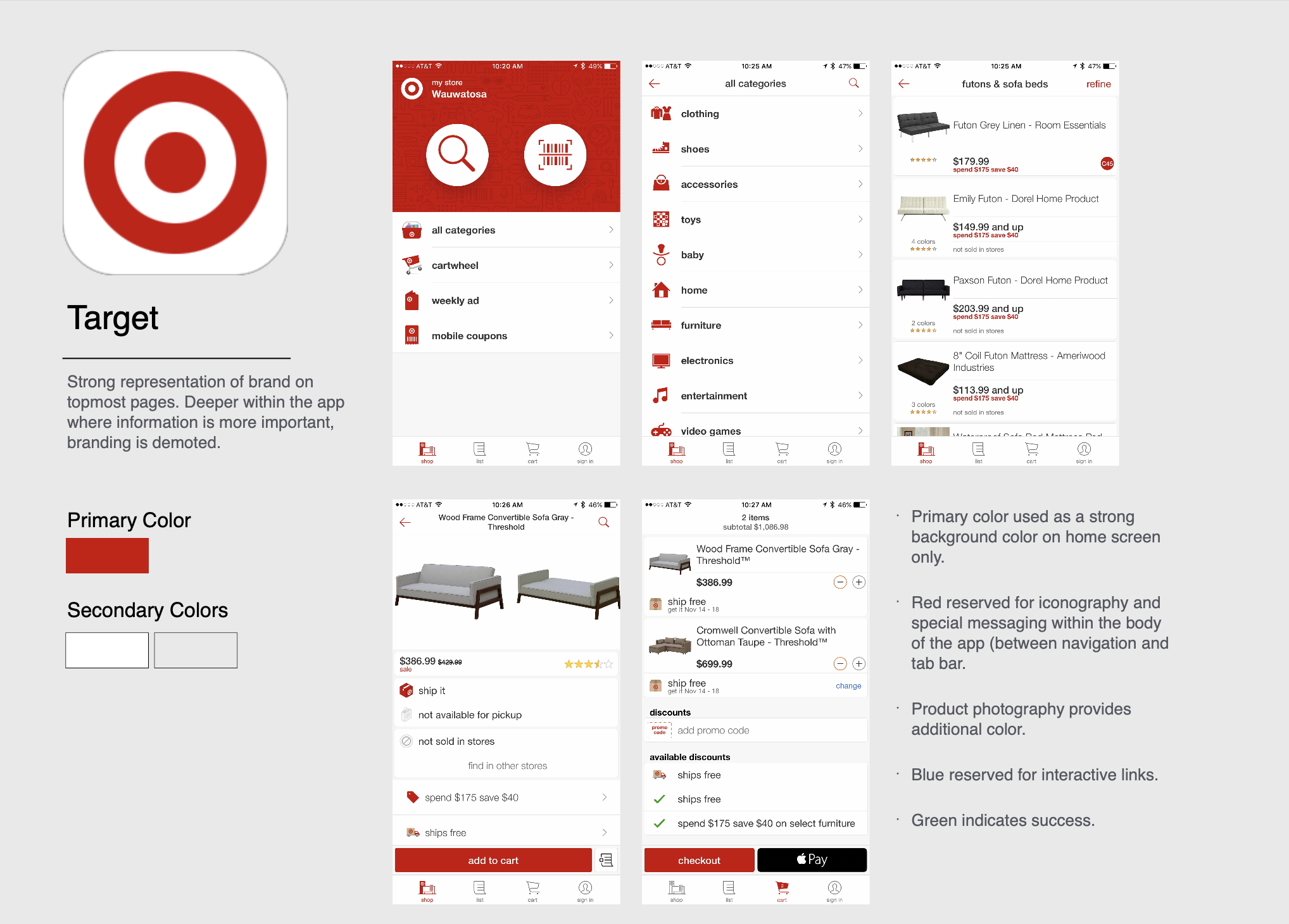
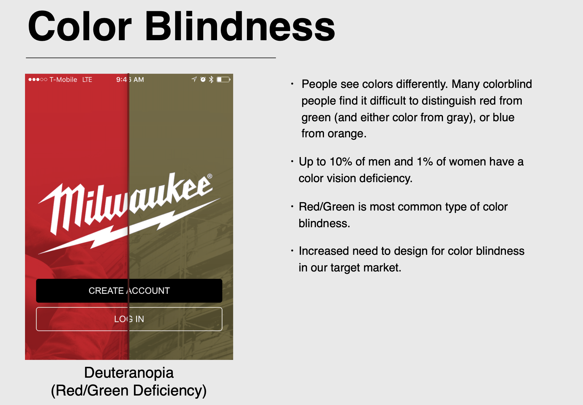
The One-Key apps were incredibly red — it was hard to differentiate sliders, buttons, and text. Marketing wanted to convey the same sense of innovation, quality, and heavy-duty equipment on the rest of the website. Unfortunately, the overuse of Milwaukee Red made the app less inclusive, less readable, and generally less usable.
I spearheaded a project to propose a new color scheme and typography to maintain the Milwaukee brand while making the app more readable. To further emphasize our point, we analyzed 20 apps with intense red colors — very few of them had the over-the-top red of Milwaukee Tool. Branding and marketing agreed: We needed a slightly refreshed and streamlined look for the One-Key apps.
User Personas
Color, Typography, and Branding Guidelines
Visual Design
Mockups of proposed changes
Competitive Analysis of other red and strongly-colored apps
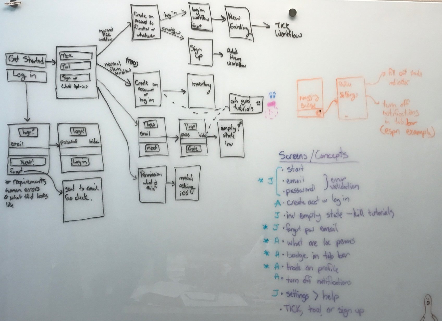
Design Sprint
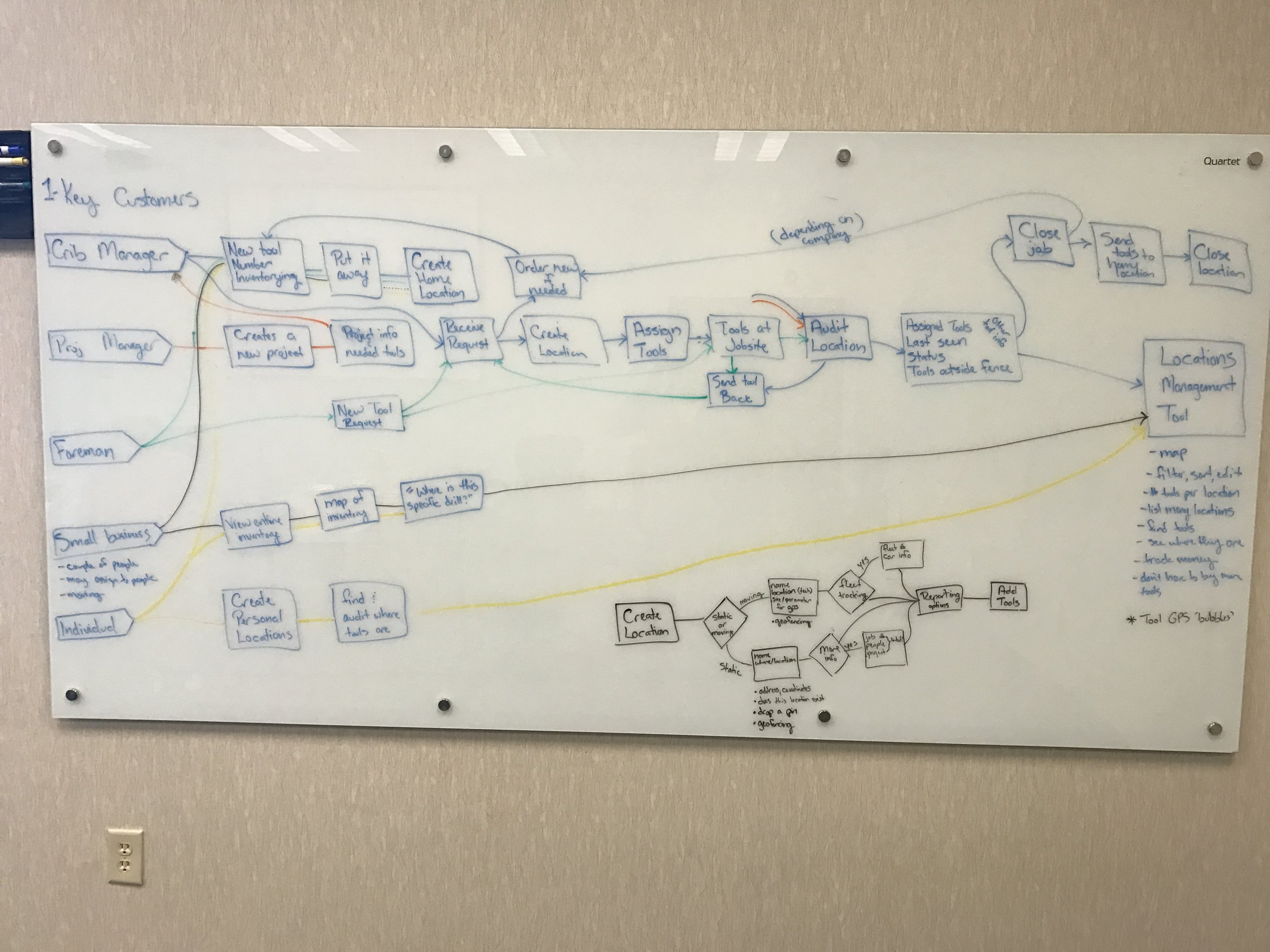
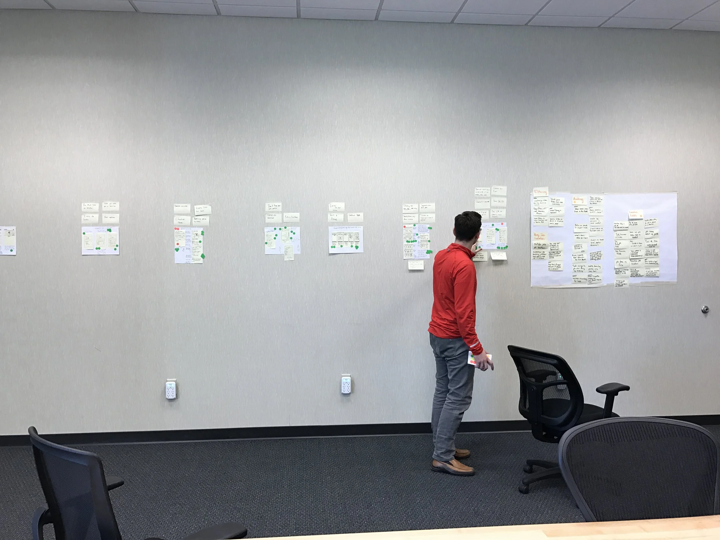
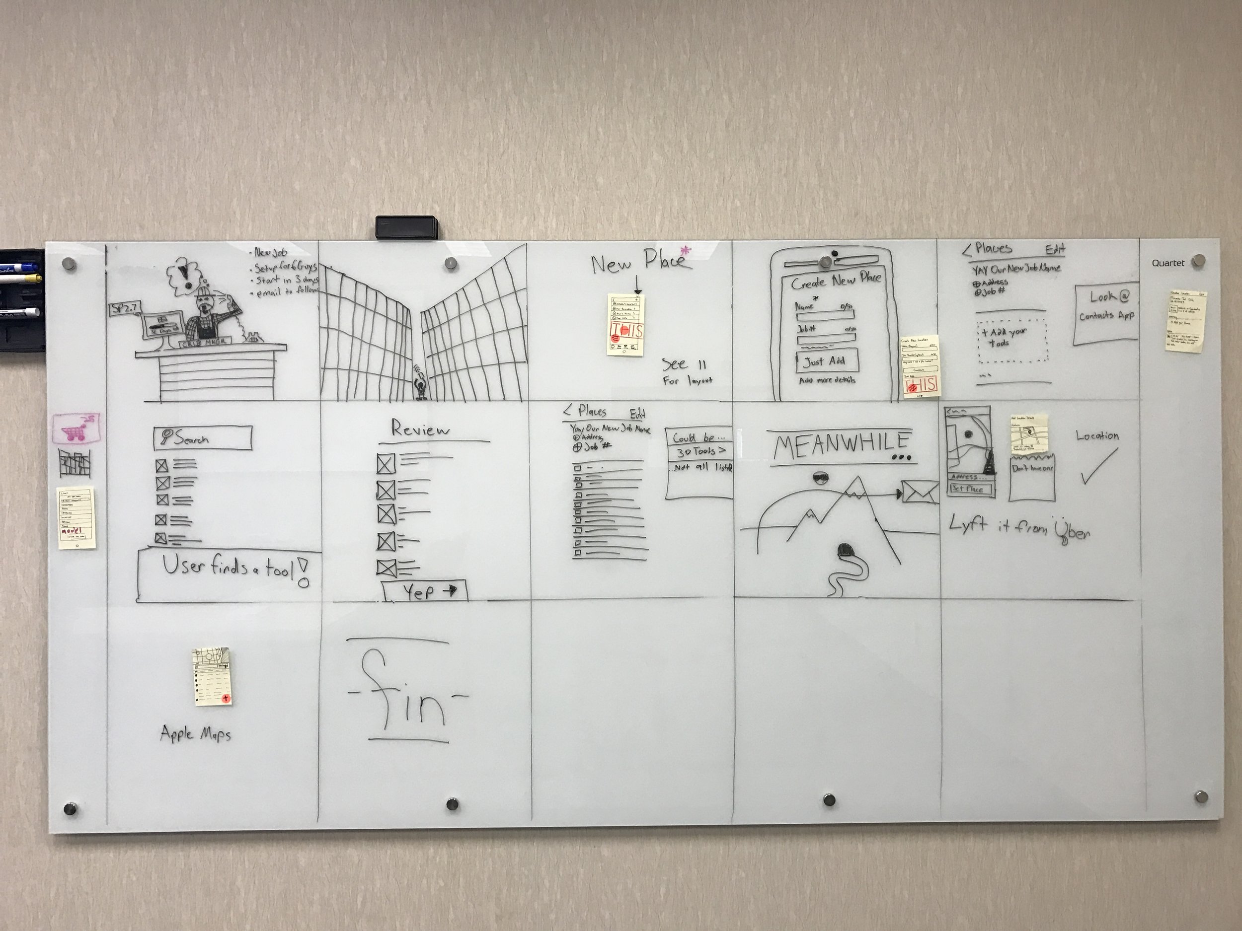
One-Key conducted its first design sprint around tool location tracking. We wanted to innovate a solution for locating your missing Milwaukee Bluetooth-enabled power tools. The UX lead and I collaborated on the design sprint preparation, and I facilitated the sessions.
We gathered a group of business stakeholders, designers, and a new-to-company business analyst. Over three days, the group used divergent and convergent activities to focus on a problem and a testable solution.
Problem ideation through mapping, storyboarding and lightning demos
Solution solving through sketching, paper prototyping, dot voting
Left with a viable idea to mockup and concept test
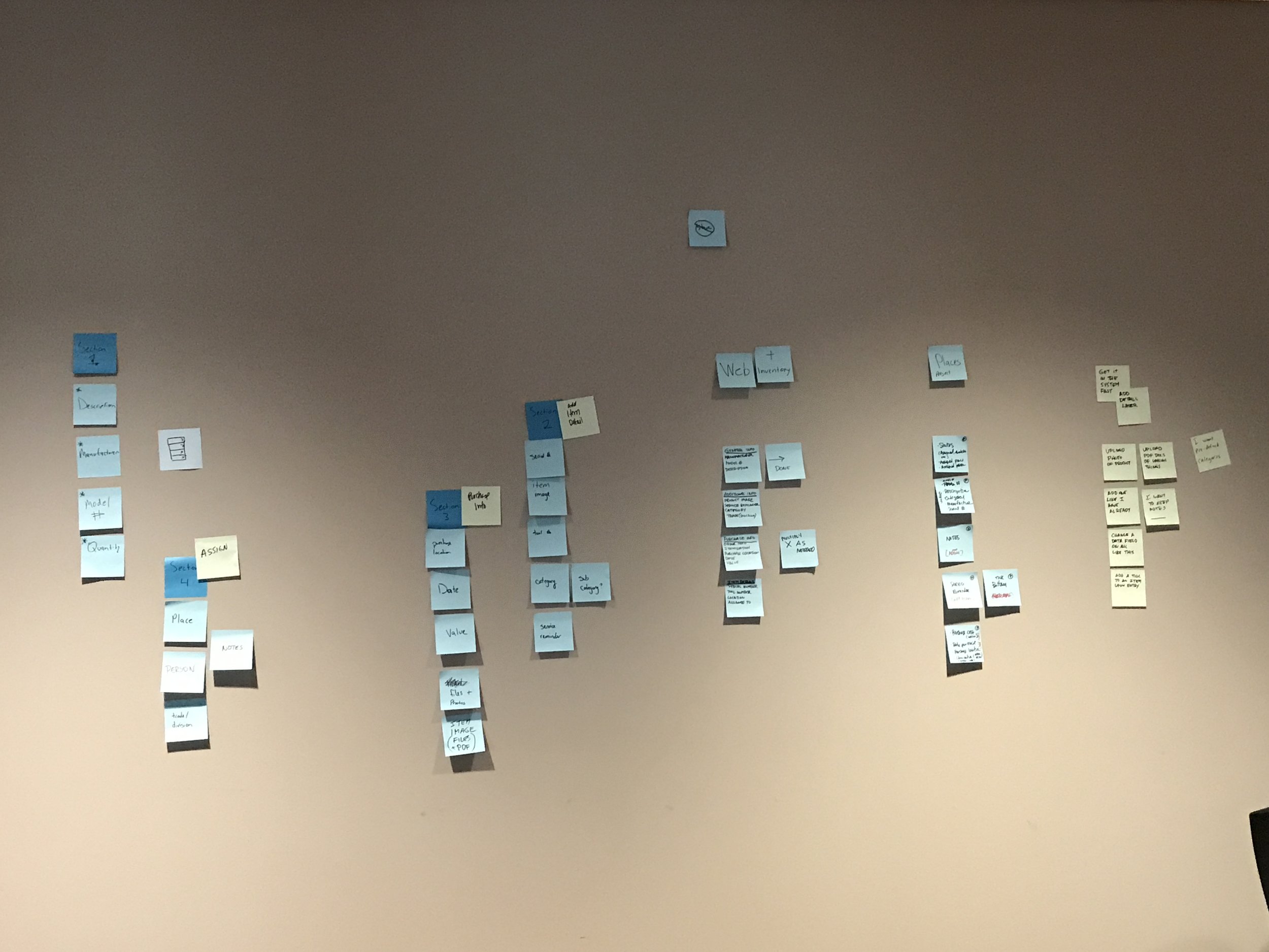
Product Design and Design System
I worked on updating the apps with new features, updates, and a general facelift in an iterative, agile fashion. We leveraged a combination of analytics and remote moderated usability testing to measure and iterate on designs. As design decisions were made, I added them to our WCAG AA compliant style guide.
I mainly focused on the One-Key app but participated in several physical tool designs, including UIs, menu navigation, workflows, and icons.
Workflow and IA
Agile Delivery
Responsive, Inclusive Design
Usability Testing and User Research